

COMPASS
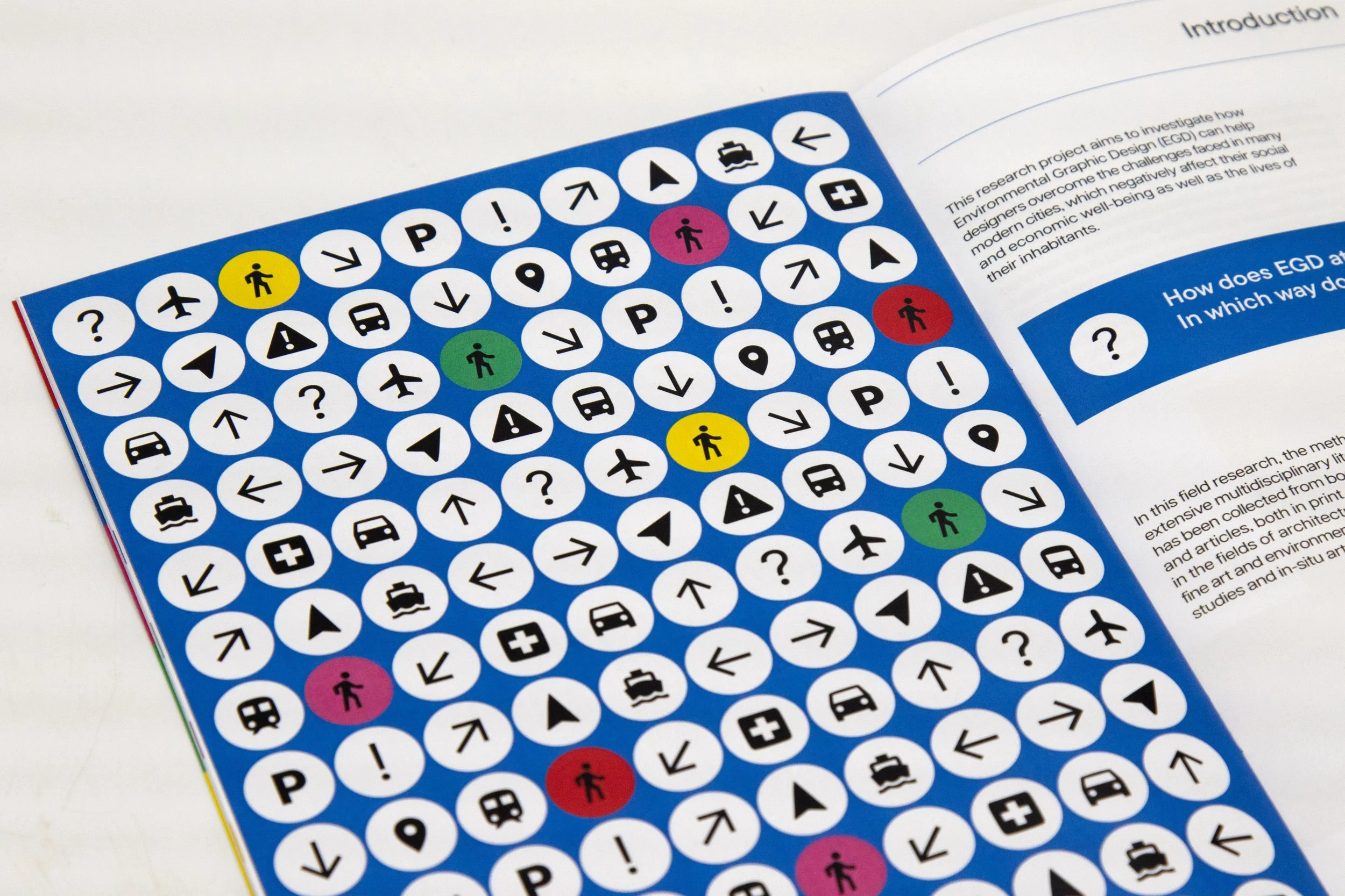
COMPASS is a publication that discusses the importance of creating intentional designs to help the world navigate the built environment that is full of clutter. The grid layout serves as a structural frame that organises the transportation icons in a way that reflects the magazine’s core theme: navigation and bringing order and clarity. The masthead and symbols on the cover reinforce this theme, positioning COMPASS as a guide through the noise of modern visual culture.
Print & Publication
Illustration

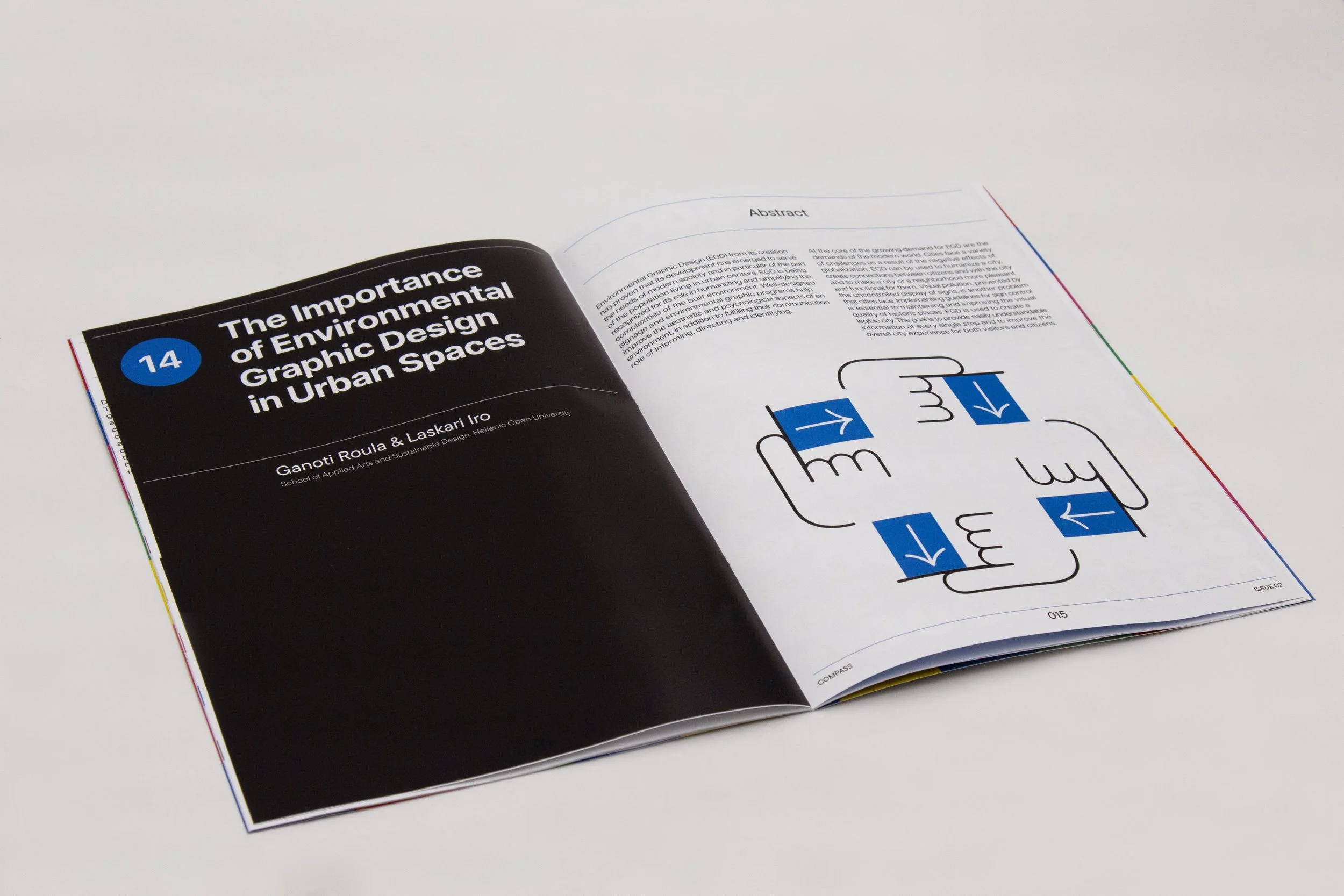

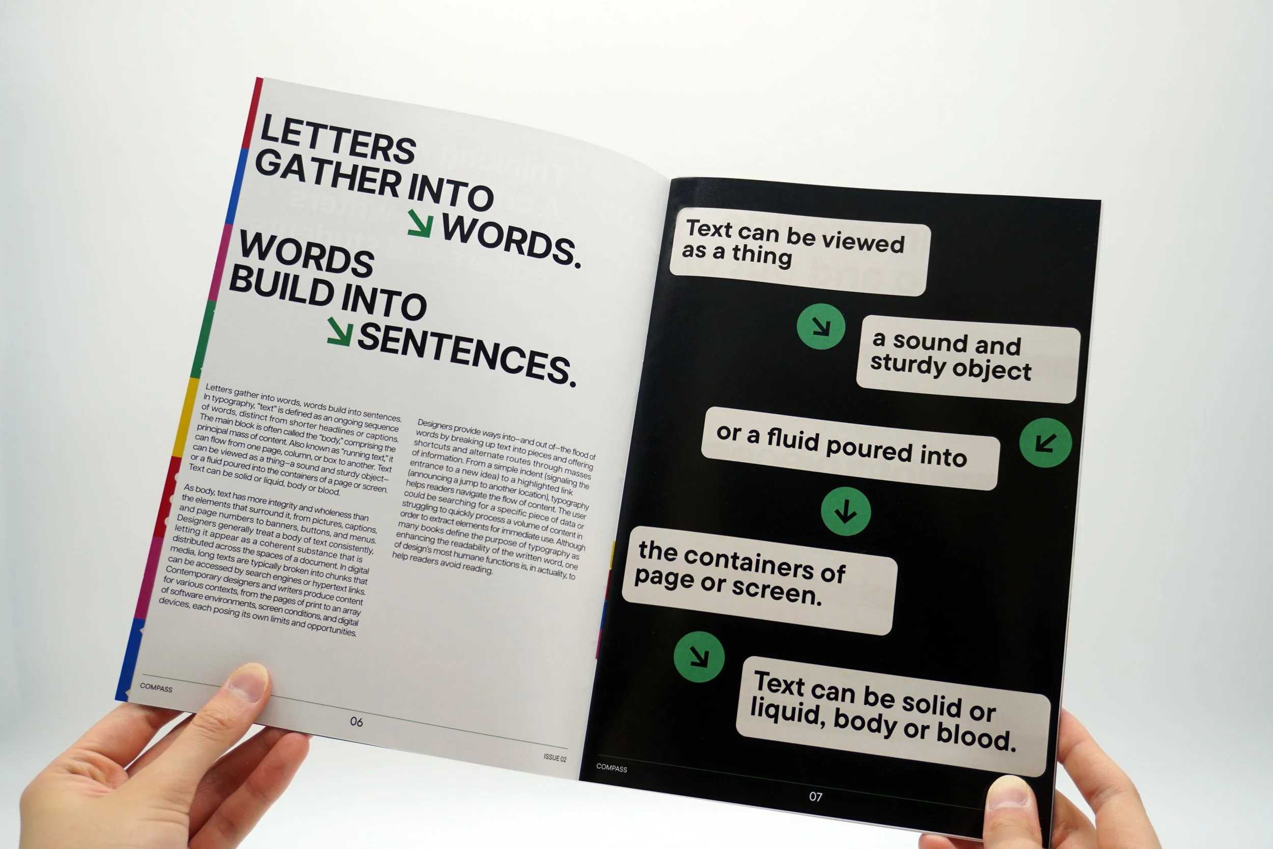
This publication was developed in response to a university brief that involved typesetting a text by Ellen Lupton and Roula Ganoti, and Iro Laskari’s article ‘The Importance of Environmental Graphic Design in Urban Spaces’. We were asked to design a magazine that communicates a clear and original theme that’s relevant to designers and is explored in the articles.
I chose to centre the magazine around the theme of navigation, drawing on the core ideas explored in the texts – particularly the importance of clarity, structure and intentional design in the built environment.
To express this visually, I implemented a strong grid system, iconography and a colour palette inspired by transportation signage. The grid layout serves as a structural frame that organises the transportation icons in a way that reflects the magazine’s core themes and positions COMPASS as a guide through the noise of modern visual culture.